

WebDevPro #105: Rethinking Error Handling with Information Architecture
Real-world insights for sharper web dev decisions

Welcome to WebDevPro #105!
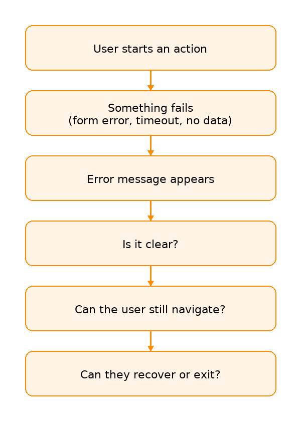
At some point, every user journey breaks. Maybe a form won’t submit. Or a page loads a 404 error. Or a search comes up empty. In any case, you’re simply left wondering, “What just happened, and... what now?”
These moments aren’t rare. They’re inevitable realities of digital experience. Yet many interfaces still treat error states as afterthoughts: blank screens, vague messages, or abrupt stops that interrupt rather than support. But failure doesn’t have to mean frustration.
In this issue of WebDevPro, we look at error handling through the lens of information architecture (IA). Inside, you’ll find practical ideas for:
Categorizing different types of failure
Writing messages that clarify next steps
Using IA patterns to preserve orientation and flow
Testing not just happy paths, but error scenarios too
All these ideas are drawn from Designing Information Architecture by Pabini Gabriel-Petit, a practical guide to creating easy-to-use experiences for digital information spaces by creating well-structured information architectures and effective navigation and search systems. You can grab a copy from Packt or Amazon.
Before we jump in, though, let’s take a quick look at last week’s most popular recommended reads:
🚀 TypeScript 5.9 released with new language features and improved developer tooling
🤖 OpenAI introduces GPT-5 with advanced reasoning, multimodal capabilities, and greater customization
🌐 European Accessibility Act set to reshape digital compliance for businesses of all sizes
Have any ideas you want to see in the next article? Hit Reply!
Advertise with us
Interested in reaching our audience? Reply to this email or write to kinnaric@packt.com.
Learn more about our sponsorship opportunities here.

⚡ Classifying the Error Landscape
Not all errors show up the same way. Some are caused by the user, some by the system, and others by the context. Knowing which kind you're dealing with helps you shape a smarter, more helpful response.
Errors can be broadly categorized into three groups:
1️⃣ User errors (e.g., invalid form input, mistyped searches): These happen when a user interacts with the interface in a way the system doesn’t accept. This might include entering the wrong format in a form field or submitting incomplete information. The best response is to clearly explain what went wrong and what the user should do next, ideally, in the same moment and space where the mistake occurred.
2️⃣ System errors (e.g., server timeouts, broken APIs): These result from backend or infrastructure issues that interrupt normal functionality. To the user, they often appear without warning and with no clear cause. It’s important to acknowledge the disruption, explain that the issue is temporary or being resolved, and provide options like retrying, saving progress, or contacting support.
3️⃣ Contextual errors (e.g., no search results, unauthorized access): These occur when a feature technically works, but the outcome falls short. These moments benefit from thoughtful messaging, suggestions for alternative actions, and guidance that helps the user reframe their task or explore another route.
Understanding these categories helps teams architect better responses. For example, user errors require in-the-moment correction, while system errors demand reassurance and fallback options. Contextual errors benefit most from content strategy; empty states can inspire new actions or explain why nothing showed up.
Effective IA begins with recognizing these failure points across journeys and structuring pathways around them.
🎯 Clear Error Design Starts with the User
Error messages should guide, not confuse. When they sound defensive, cryptic, or technical, users feel like they’ve hit a wall and their trust takes a hit.
Instead of mirroring backend logs or internal logic, focus on what the user was trying to do and how to help them move forward. A vague “Something went wrong” doesn’t help. Neither does a passive-aggressive “Invalid input.”
Think about these two kinds of experiences:
❌ “Something went wrong.”
✅ “We couldn’t process your request. Please check your internet connection and try again.”
Or these two experiences:
❌ “Invalid input.”
✅ “This field should only contain numbers.”
In both cases, the second option informs and empowers users. Clear, helpful language is key. That means:
Descriptive labels (“Enter a valid email address”)
Actionable guidance (“Try a different filter”)
Friendly tone (“We couldn’t find that page. Want to go back home?”)
Clear content categories and navigation cues reduce the chances of errors in the first place, and make recovery intuitive when they occur.
🔄 Fallbacks, Not Dead Ends
Error states often expose weak points in navigation. Broken links or empty searches should never leave users lost or stranded.
When a user encounters an error state, the interface should support forward movement, not abandonment. That’s where fallback navigation comes in. Strong IA includes contingency planning for every type of failure, providing structure and continuity even when primary content can’t load or return useful results.
Effective information architecture gives users clear paths forward by:
Suggesting content in empty states (e.g., showing auto-correct results or popular/related content)
Providing alternative navigation paths from 404 pages (e.g., linking to top site categories, including a search bar, or displaying recent posts)
Clearly showing where they are and how they got there (e.g., preserving page titles, navigation context, and section headers even when content fails to load)
These elements act as quiet supports that help users regain their footing without getting in the way. Rather than stopping progress, they offer just enough structure to help people reorient, adjust, and keep going.
Maintaining visual consistency is equally important. Keeping headers, menus, and overall page context visible helps users stay grounded. They know where they are and how to move forward.
The goal isn't to cover up the error. It's to work with it to design through the disruption and turn a broken moment into a path forward.
🚨 Anticipating System Breakdowns
From an IA perspective, resilient systems rely on a clear separation of content, structure, and control logic. This allows the interface to degrade gracefully when something goes wrong, rather than collapsing entirely.
Here’s how thoughtful information architecture supports recovery during system failures:
Using design patterns that support flexible navigation and progressive disclosure: When part of the system breaks, the interface shouldn’t lock the user out of everything else. Progressive disclosure allows content to load in layers or segments, so if one module fails, others still work. Flexible navigation ensures users can still move through the site even if some panels, widgets, or dynamic content aren’t available.
Predefining the hierarchy and visibility rules of messages across device types: Error messages and fallback components need to appear in predictable, accessible locations across screen sizes and layouts. By defining message priority and placement early in the IA process, you make sure that important feedback doesn't get buried or disappear. Users should always know what happened and what they can do next, no matter what device they’re using.
Ensuring error overlays don’t obscure navigation or state indicators: When displaying modals or banners for system errors, avoid covering global navigation, breadcrumbs, or progress indicators. These elements provide orientation, and users rely on them, especially during disruption. Let the error be visible, but don’t let it block the ability to explore or exit gracefully.
These small design decisions add up. When users can still find their way, access key actions, and understand what’s happening — even when parts of the system fail — you’re building trust into the experience itself.
🛤️ Testing the Rough Paths Too
Most usability tests focus on the smooth, expected path. But real users don’t always follow that. This could be down to mismatched queries, unexpected clicks, or network slowdowns.
During testing, ask questions like:
What’s the most common way this could fail?
What does the user see when it does?
How clearly does the interface explain what happened and what to do next
Can you add or improve navigation, messaging, or structure to help the user recover
Does the interface maintain its structure and orientation, or does it leave users disoriented?
Are users given a clear sense of what they can do next, or do they exit the experience?
Testing these moments with intent helps you tighten IA, strengthen messaging, and close experience gaps before they show up in production.
📍 Sprint Challenge: Map a Fail State
Fail states are everywhere. This week, why not look into your own? Pick a screen or flow such as checkout, search, or login. Revisit it with fresh eyes and ask yourself the above questions.
Once you’ve reflected, make one small improvement. It could be a clearer error message, a more helpful fallback screen, or a set of navigation links that guide users forward. Share it with a teammate and ask, “Would this help you get back on track?”
Got 60 seconds? Tell us what clicked (or didn’t)
📚 Want to go deeper?
Error handling is just one piece of the puzzle.
Designing Information Architecture dives deeper into navigation, structure, and the systems that help users find their way, even in complex digital spaces.

Cheers!
Editor-in-chief,
Kinnari Chohan